Data Map
The data map allows users to visualise the resources in their cloud environment in an intuitive way.
Introduction
This is a project I worked on at Symmetry along with a couple of colleagues. I lead the UX design for this feature and contributed to style changes in code.
What is it?
The Data Map is a tool that allows users to intuitively visualise the access paths that exist between resources in their cloud environments. Instead of rummaging through charts and tables on data-heavy dashboards, the Map offers users a fresh, visual-first approach to explore their environments.
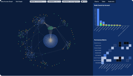
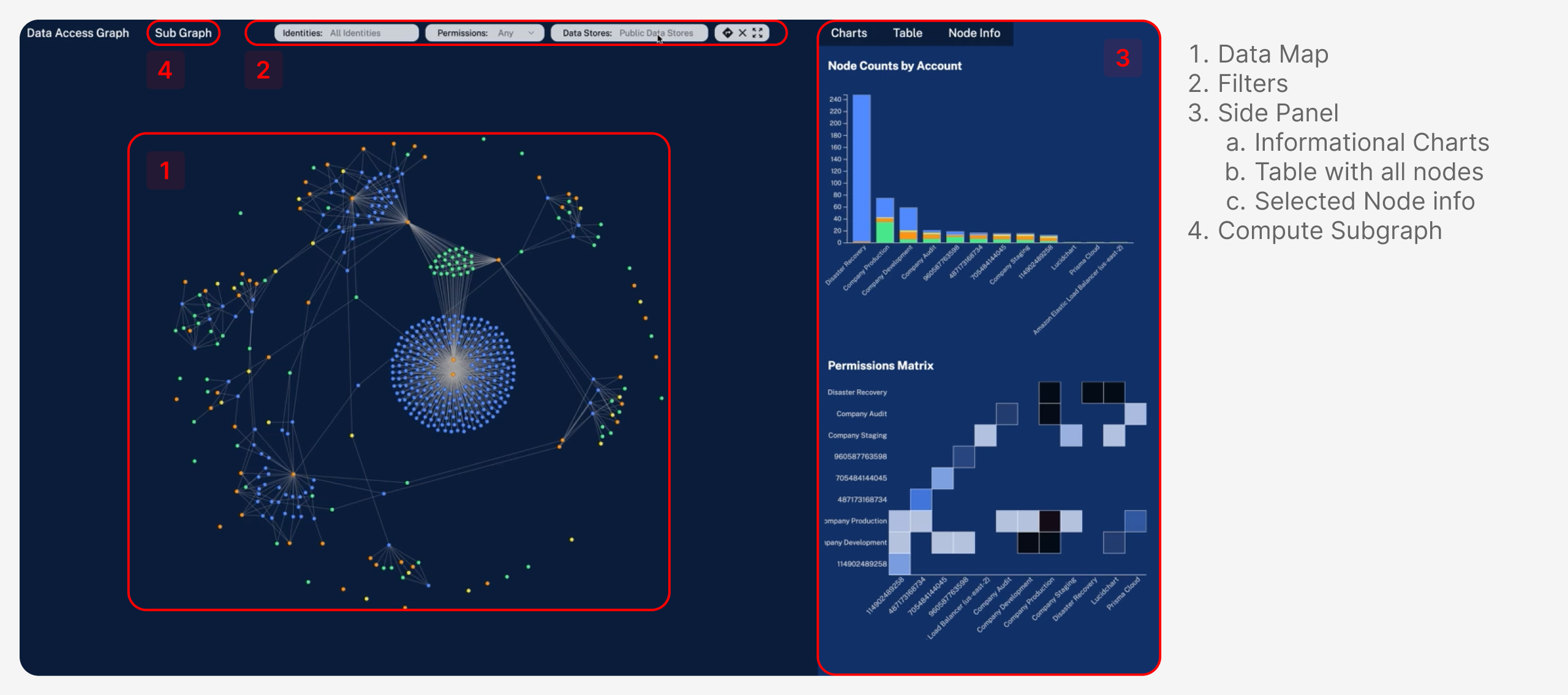
The Map’s setup is simple: each node (circle) represents an identity or data resource, and each edge (line) represents a permission or operation path that exists between two resources. By synthesising complex concepts into simple forms, the Map has enabled users to build a visual model of their cloud environments and track risks proactively.
Taking a look under the hood, it’s built on top of Flask and vanilla JavaScript. The visualization is being handled by D3, a JavaScript library built specifically for data visualization. This is where the Map suffers, since it doesn’t use React in its frontend (unlike the rest of the product), which makes managing components and states a tedious task.
The Opportunity
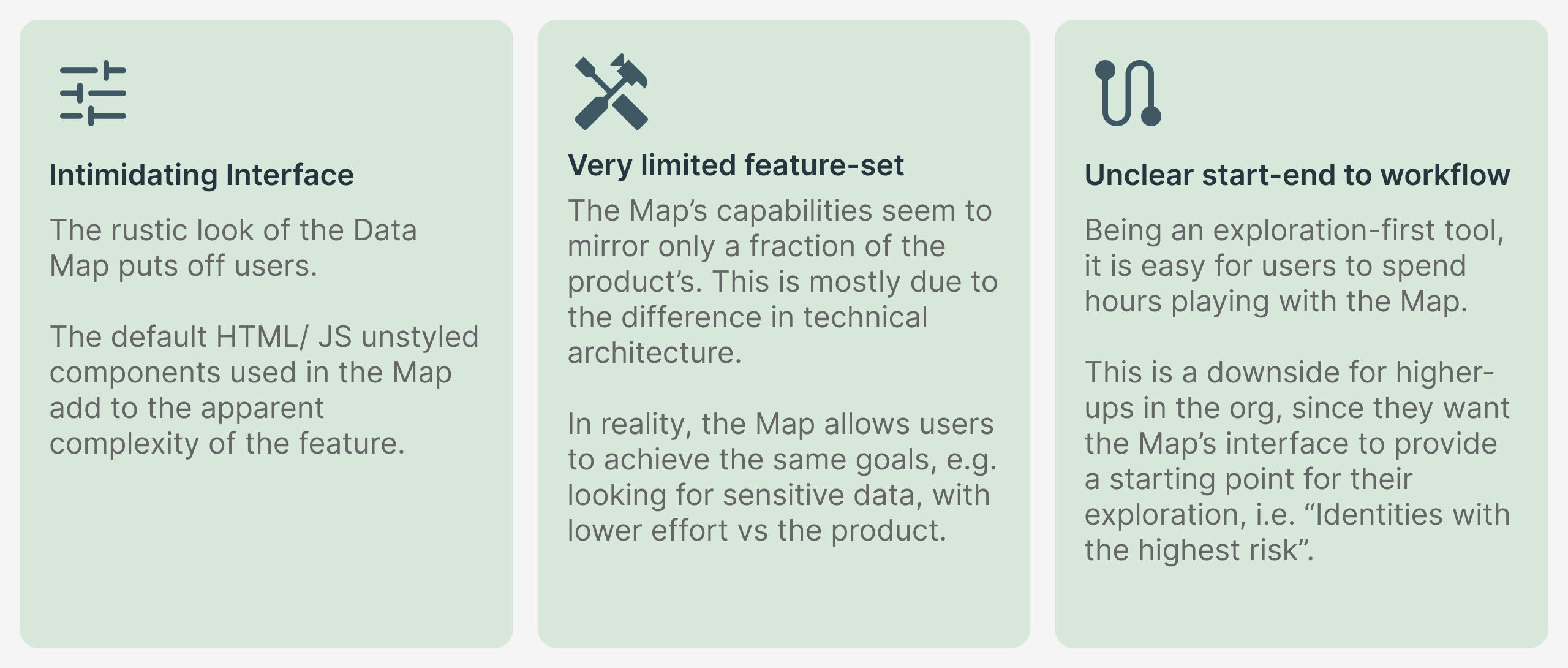
Being a sophisticated tool to engineer, the map could not be built with the same tools used for the rest of the product. In its current form, the Map:
- ...is mainly an exploratory tool
- ...has no defined usage patterns
- ...visual language doesn’t match rest of the product
- ...is difficult to use for users with lower technical proficiency
The current state of the map leaves more to be desired. Its full potential remains untapped, and the disconnect from the rest of the product poses a major usability issue.
Process
Instead of showing a typical process that covers user flows, information architectures, and other run-of-the-mill elements, my aim is to provide glimpse into the high-level thinking and diverse thought processes that shaped the project. Given the Data Map’s unique position as a tool within an already established product, we had to try our best to leverage already existing usage patterns and provide a natural segue into the Map.
The Data Map’s unique position as a tool within an already established product, we had to try our best to leverage already existing usage patterns and provide a natural segue into the Map. We also had to make sure the revamp meets a wide range of use cases: from discovery to remediation.
Understanding Users
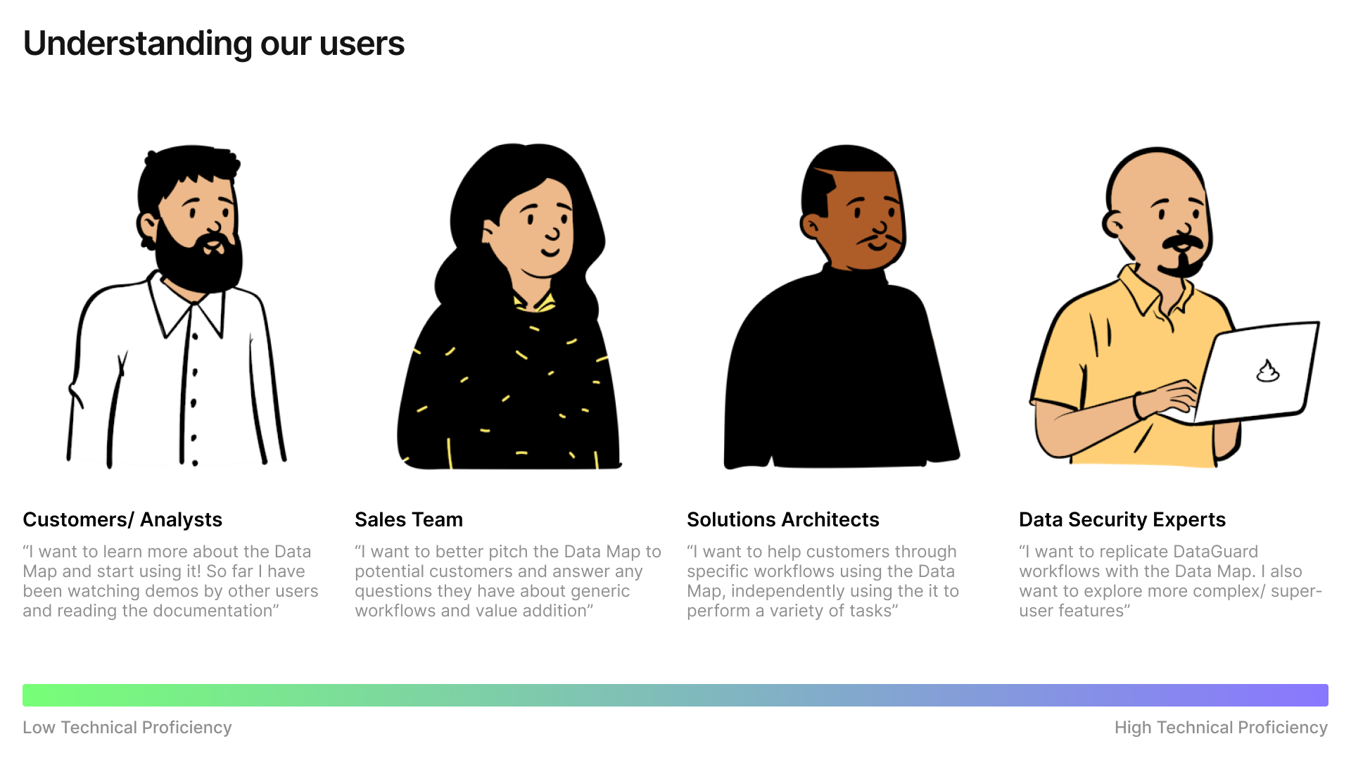
What do our users say?
Based on conversations with over a dozen users, we found these major pain points:
These gave the team a good starting point to start thinking about the next implementation of the Map. In addition to user problems, we got to know the exact context in which the Map is used - giving us a deeper level of insight.
Our Approach
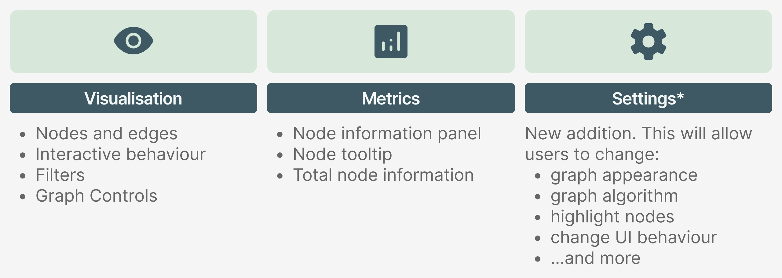
We decided to break down the Map into its simplest constituents and see how we could add value to each pillar. This is how the Map is currently structured.
Next, we needed a way to surface the system status. Since the Map is computation heavy, users have to be told what’s happening behind the scenes. This is a little tricky, because the every time a user applies a filter, the graph’s edges have to be computed again. Just freezing the entire interface every time something is processing will be bad for the user experience.
Additionally, the newly added components will be on/ visible by default for a short period of time after their initial release. This helps users discover these features easily, and familiarise themselves with the new additions over time.

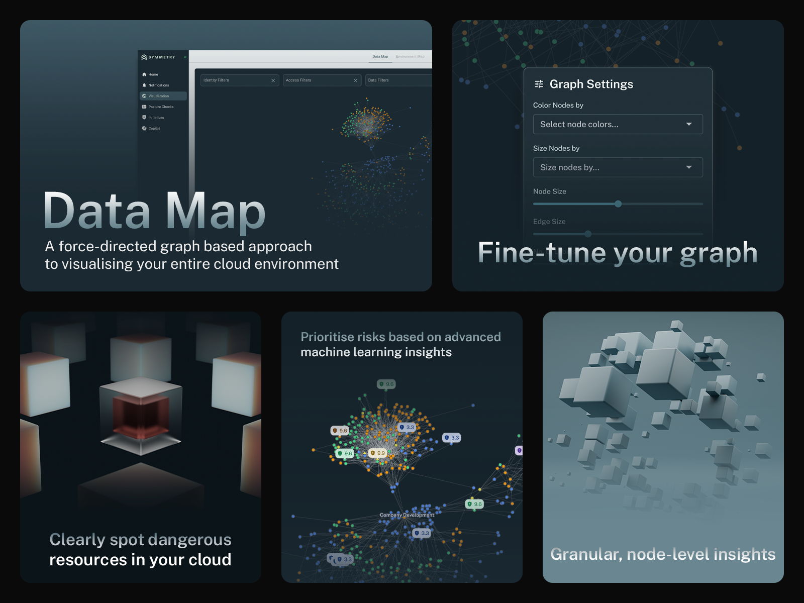
Visual Design
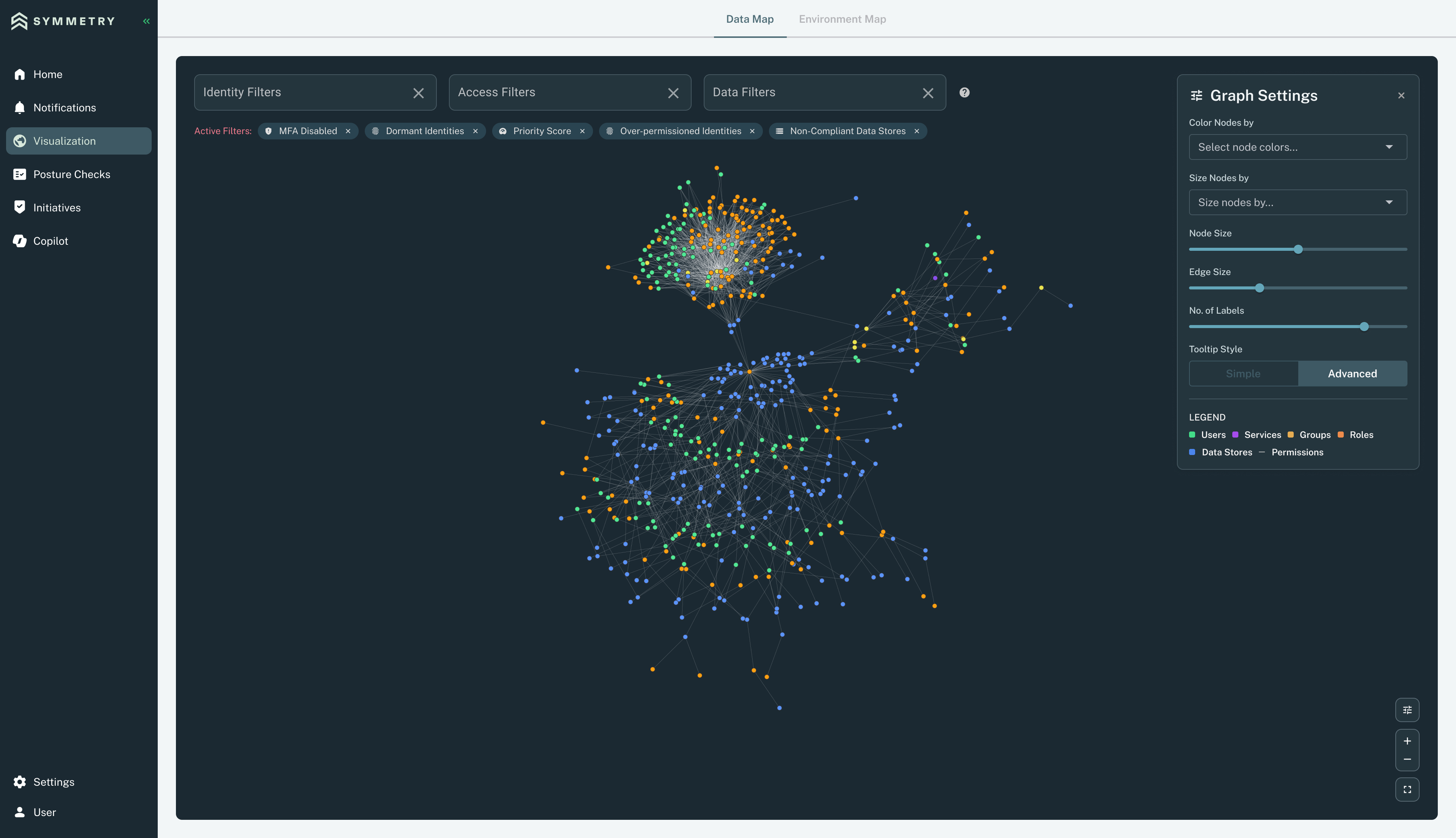
This is the redesigned Data Map. It’s a departure from the cramped, rigid layout into something more modern and breathable. The main focus with the redesign was to let users focus 100% on their environment, reducing the friction. Elements in the interface have been kept to a minimum or in their minimised state - ultimately reducing cognitive load and giving users an empty canvas to pursue their workflows.
The Data Map has a cousin, the Environment Map, but that’s a story for another time :)
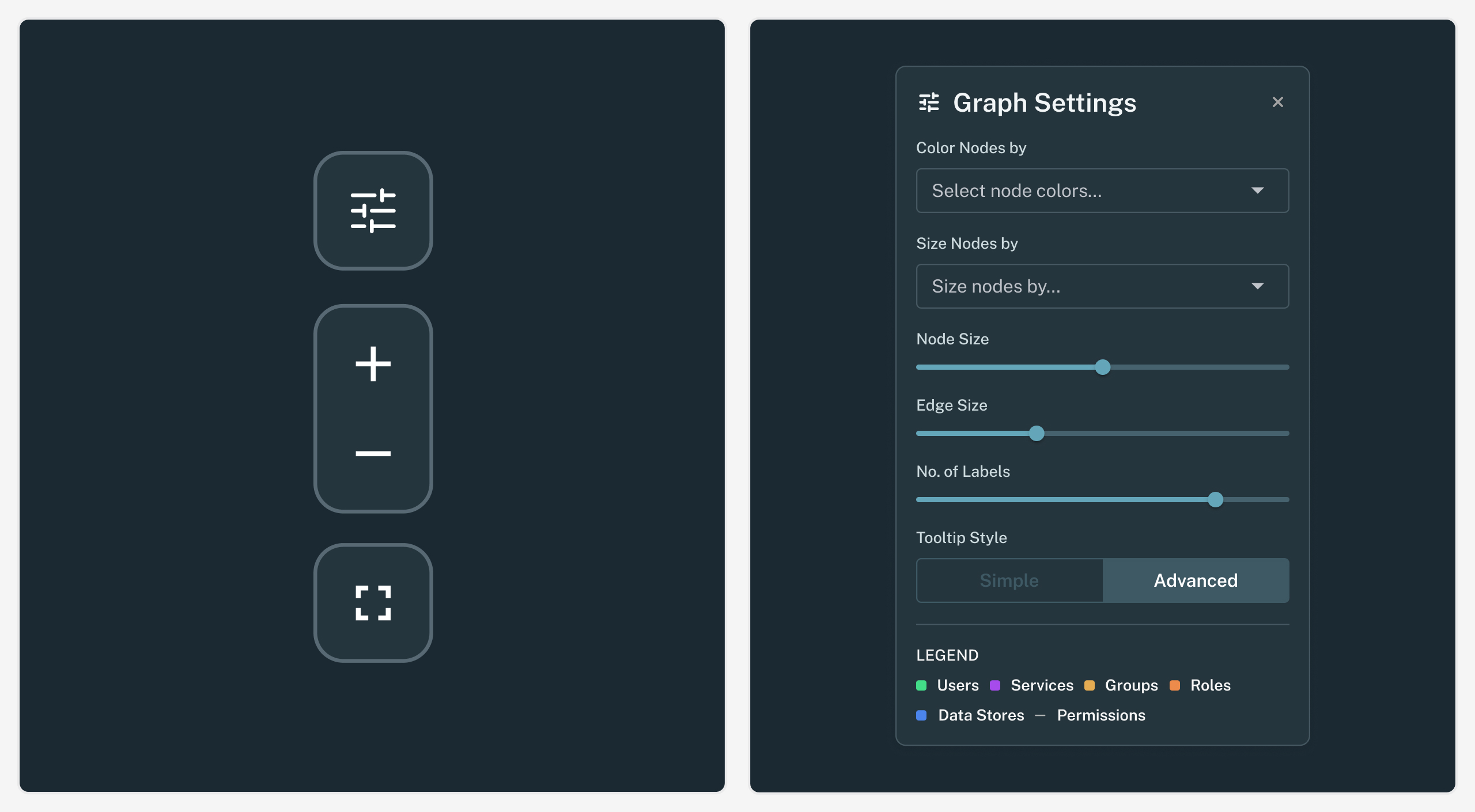
The map was missing basic controls such as zooming and reset to 100%. These have now been added to tell users that the map is interactive. Also, there is no substitute for traditional interactions, even if you have have gesture controls and keyboard shortcuts built in.
Additionally, we added a collapsible settings panel that allows users to fine-tune the appearance of the Map. These settings add a different dimension to the graph, allowing users to get a holistic picture of their environment.
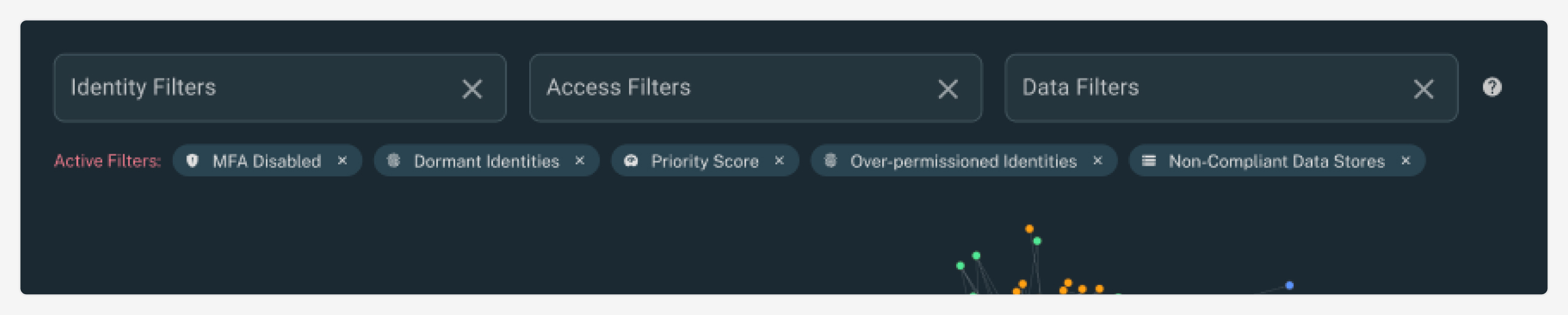
With the new Map, users can apply as many filters as they want and even clear specific ones they don’t need. This is a big step up from the earlier version, where users could only apply one filter from each of the three attributes. Additionally, filters have special logic applied to them. Using modifier keys such as “Shift” or “Command/ Control”, users can change the logic that is applied between two filters from AND to OR.
Outcomes
Once the new Data Map was shipped, we were met with a ton of great feedback and appreciation. Our decision to put the actual Map in focus and declutter the UI was received well by our customers. Our biggest win was that the Map had changed from being an intimidating tool, to being something that excited people.
The idea of having a tool with a relatively quick learning curve was appealing to our users. This resulted in some great conversations, and a lot of feature requests that continue to keep the team busy.
Learnings
Revamping and shipping this feature felt like operating a start- up within a start-up. Beyond learning new technologies, I’d have to say that my biggest takeaway was adopting a “ship- fast” mentality. This is crucial for small product teams, where constant feedback and multiple cycles of iterations help refine the product into something well-rounded.
The team had many great ideas along the way, but I learnt to prioritize ones that are crucial to ensure a strong baseline user experience. Since we would be completely revamping this feature, we had to balance innovation with familiarity.
Maintaining a connection between users’ expectations and mental models ensured that the revamp would be well received, and not cause a disruption. We had to go back and forth between a lot of logical concepts before deciding on final interactions to ship.