Decent Espresso UI
Role
Individual Contributor, self-led
Scope
Experience Design, Interface Design, Visual Design, Research
Brief
Making brewing coffee on the Decent easier and more intuitive
Introduction
Can you tell that I like coffee? Well done!
Espresso is considered one of the most difficult form of coffee brewing. But it doesn’t have to be. Passing water through a puck of finely ground coffee beans at 9-10 bars of pressure is the gold standard set by INEI (Istituto Nazionale Espresso Italiano).
Espresso popularity has bolted in recent times, and technological innovation is supplementing the caffeine-hungry needs of coffee people around the globe.
Legacy brands like La Marzocco, Mahlkonig and La Pavoni have been left in the dust (and they make some brilliant coffee products) by newer, younger companies that embrace technology.
Decent happens to be one of them.
Overview
Decent is a Seattle-based manufacturer of high-end espresso machines. The company is known for its premium, technology-driven machines that have been making waves in the coffee world since launch. There are currently three models: DE1 Pro, DE1XL & DE1XXL
The DE1 Pro is pictured below:
(add image)
The price point of the Decent is highly competitive, but their machines aren’t. They’re in a league of their own. The machines start at USD 3499 and go all the way up to USD 4299!
The Decent comes with a tablet, which is the brains of the entire system. All the interactions with the machine are done through the software. This approach makes the Decent have microscopic control over many parameters not possible in traditional espresso machines, especially at this price point (yes, there are machines that cost more than USD 3500 🤯)
The tablet runs its own software, built from scratch by founder and software engineer maestro John Buckman (personal website).
The software is open source (here is a link to the repo on GitHub)
This project aims to assess and modify the UX and UI of the companion tablet that ships with Decent espresso machines.
I was quite intrigued the first time I saw the UI and the entire process of dialling in a shot. Better user experience is expected from a machine of this cost and caliber.
Join me in this escalating nerdery :)
Define Design Brief
Currently, Decent is one of the most polished technology-led espresso machines. I keep repeating myself on this matter because the Decent truly is an ocean of possibilities.
There are no serious problems with the UI, as it serves the purpose and is very clear. However, the UX front is where some improvements can be made.
Here are some screenshots of the UI:
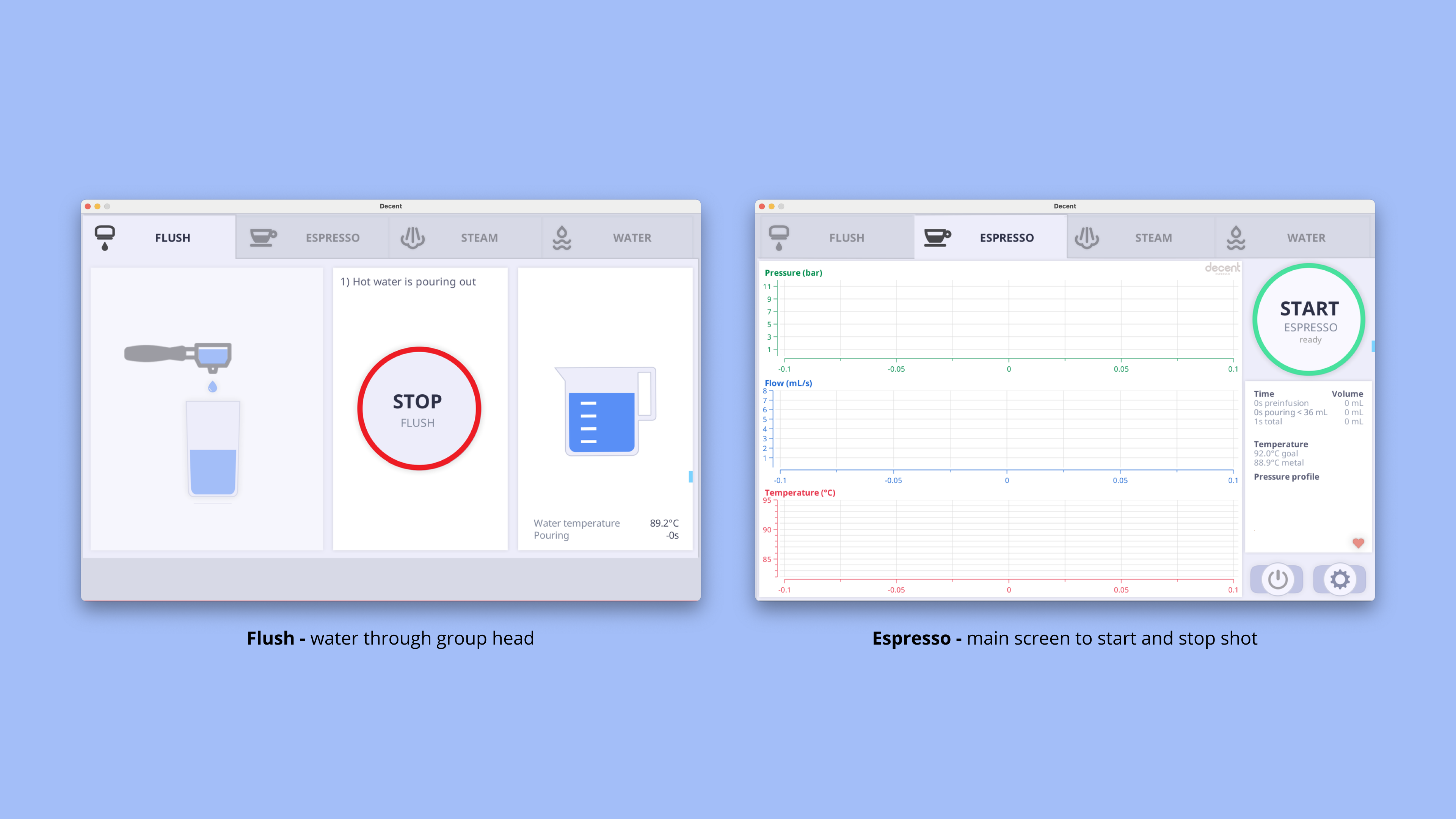
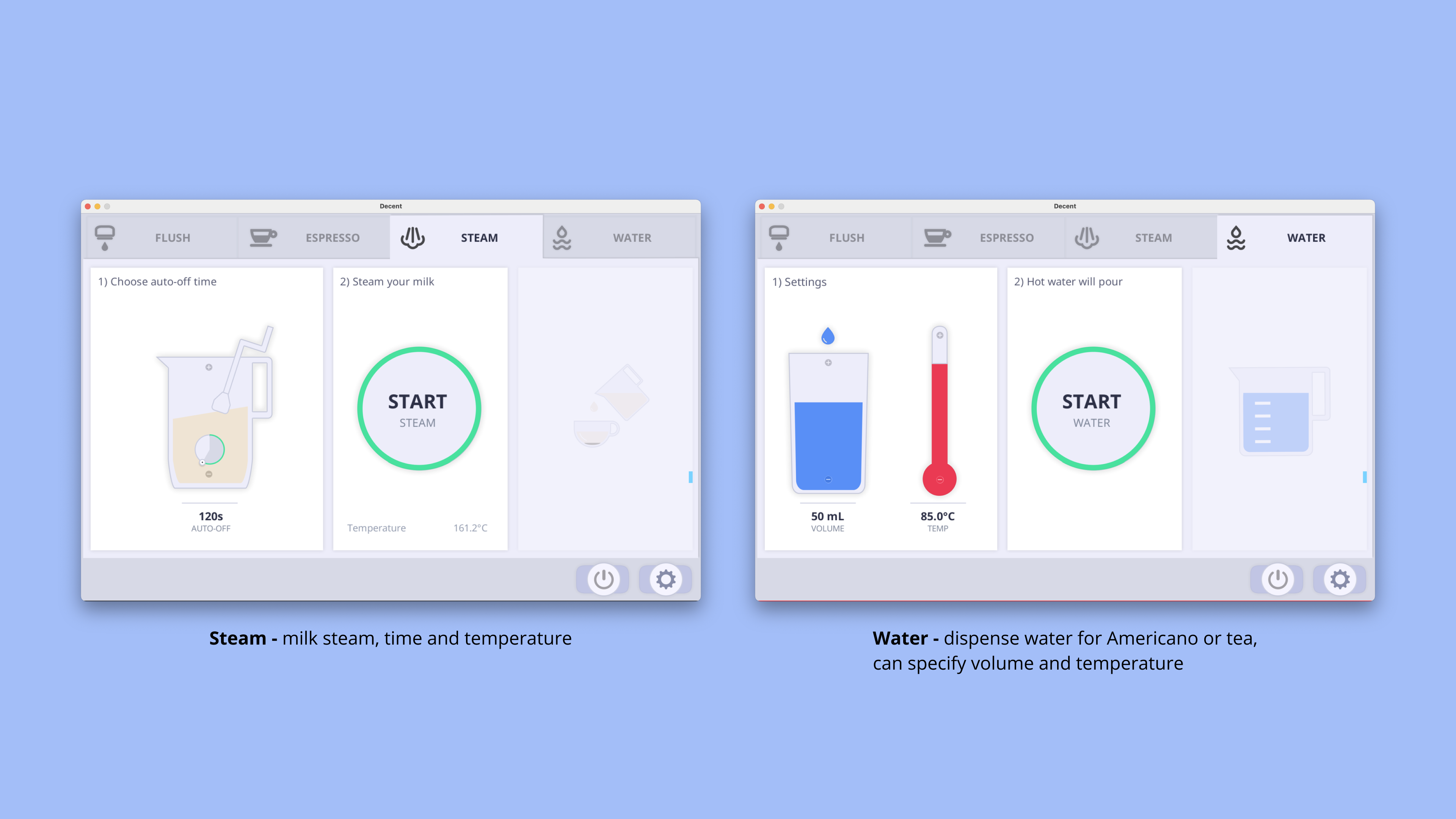
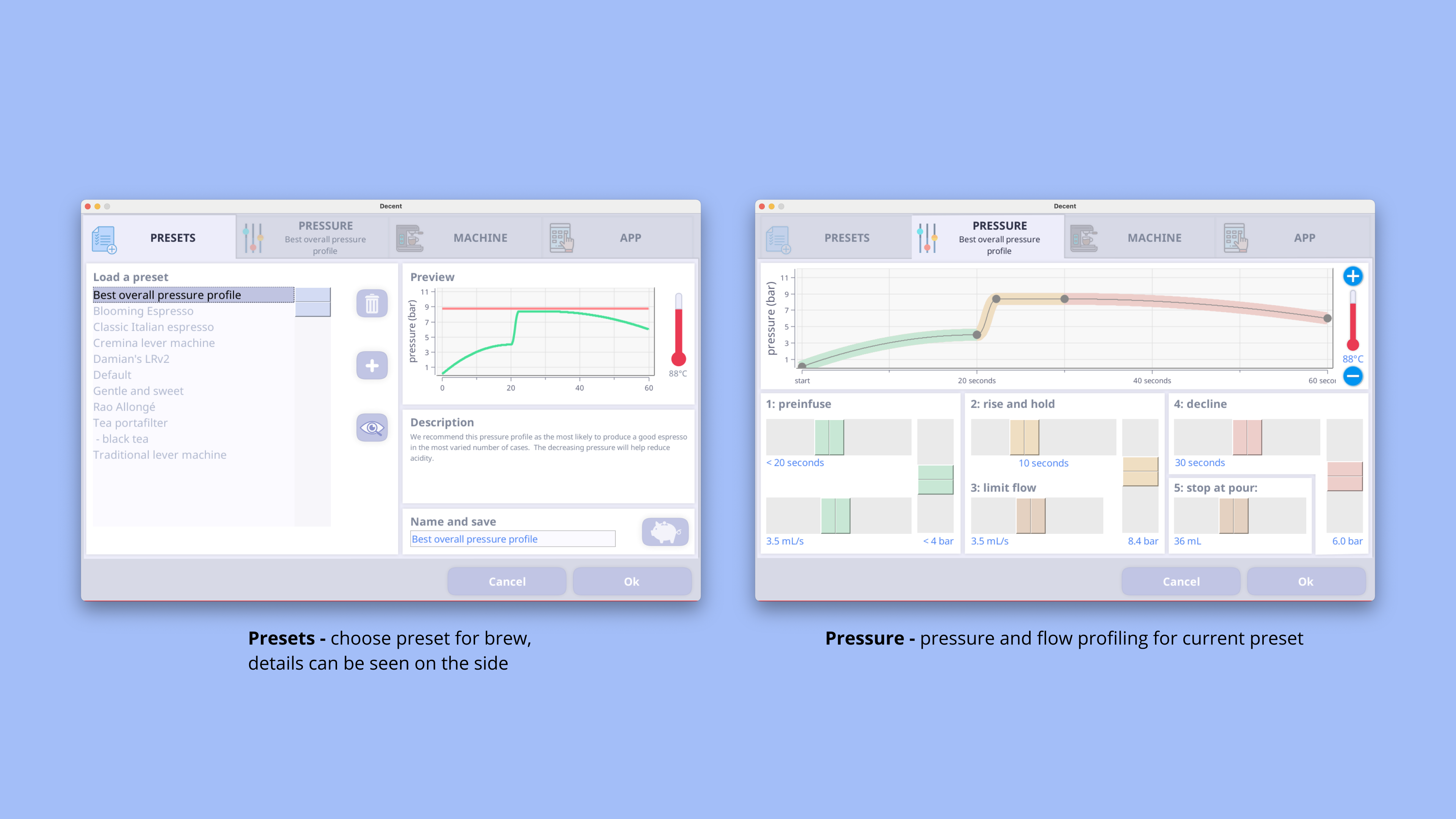

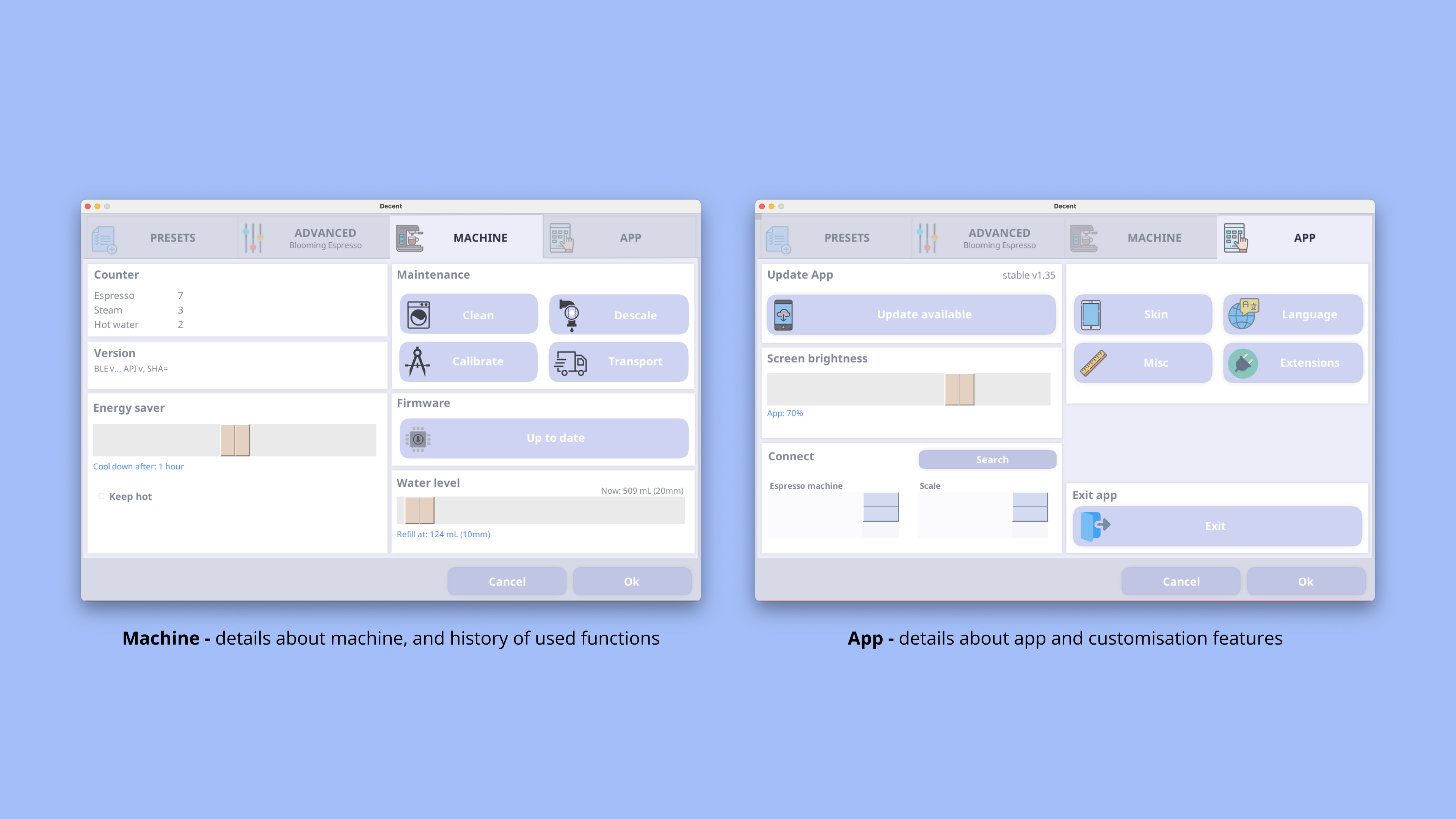
After clicking every single button and interacting with every screen, here are my findings:
- Unclear information architecture
- Missing labels in screens
- Misleading settings button
- UI looks unfinished - like a staging flat with plastic fruits
How can we take this substantial list of features and provide the user with complete control?
Understanding Users
The average Decent user is far more than decent in their coffee-making capabilities. The high cost of the machine attracts people with serious coffee game. Therefore, it can be understood that the users are actively keeping track of what will make their coffee better. A few extra steps or some added effort will be welcomed if it results in a better cup.
It is also important to keep in mind that the users breathe in coffee jargon. This is important in designing the UX since the users don’t need to be walked through each step of the process. Ergo, we might as well incorporate a few extra touches in the workflow order for the user to get complete control over their settings (will be evident shortly)
Understand Requirements
The Decent tablet exists for two reasons: it looks super rad, second and more importantly, to precisely dial in a shot. The tablet also gives access machine vitals such as temperature and water level, but they are hidden under a pile of menus.
Making these features easily accessible, preferably on a single menu, will increase the usability of the tablet and lead to a shorter workflow time.
Below are pictures of some of the planning and thinking that went into this project:
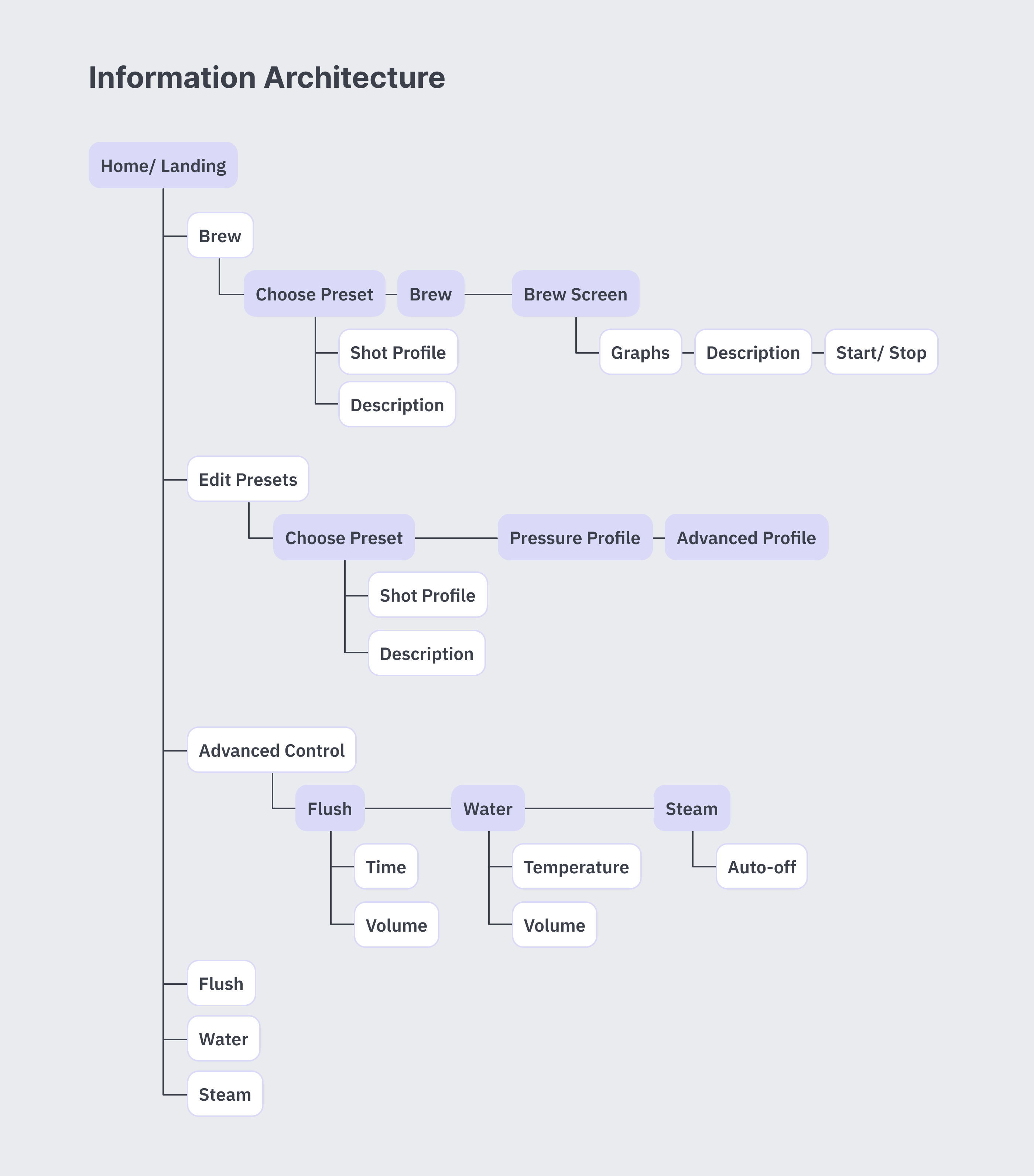
Information Architecture
Since I am planning this application to only one a main page to act as a connection between all pages, it is important to make sure all relevant interactions fit within the dimensions of the tablet.
Visual Design
I enjoyed reworking on the UI and making it more polished. I am quite proud of the clean and minimal look that I have achieved over multiple iterations.
Make sure you have a cup of coffee with you when you are scrolling ;)
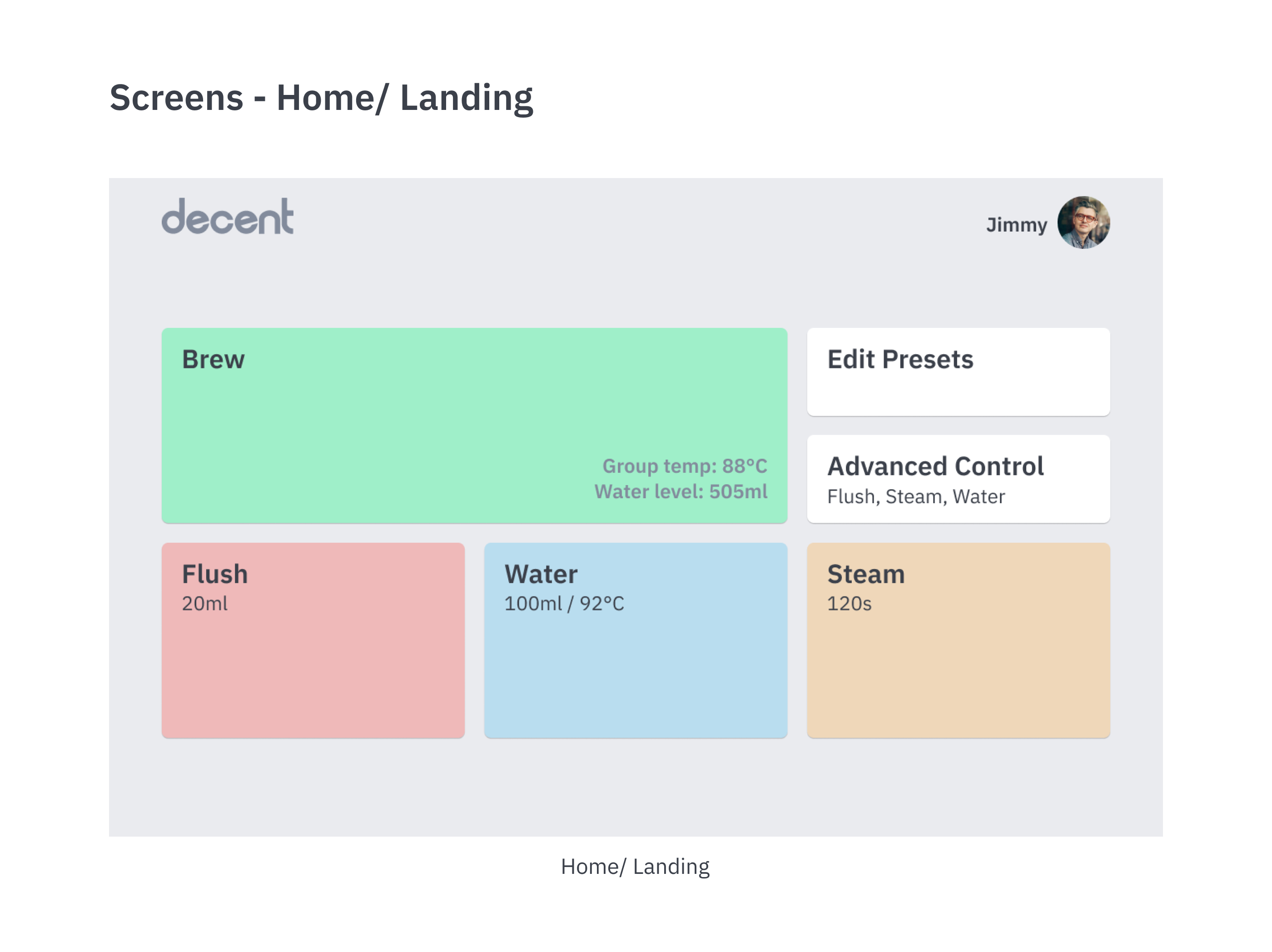
The placement of the flush, water and steam buttons correspond to physical placement of the functions on the machine. Flush and water utilise the group head (i.e. the middle of the machine) and the steam wand is on the right side of the machine.
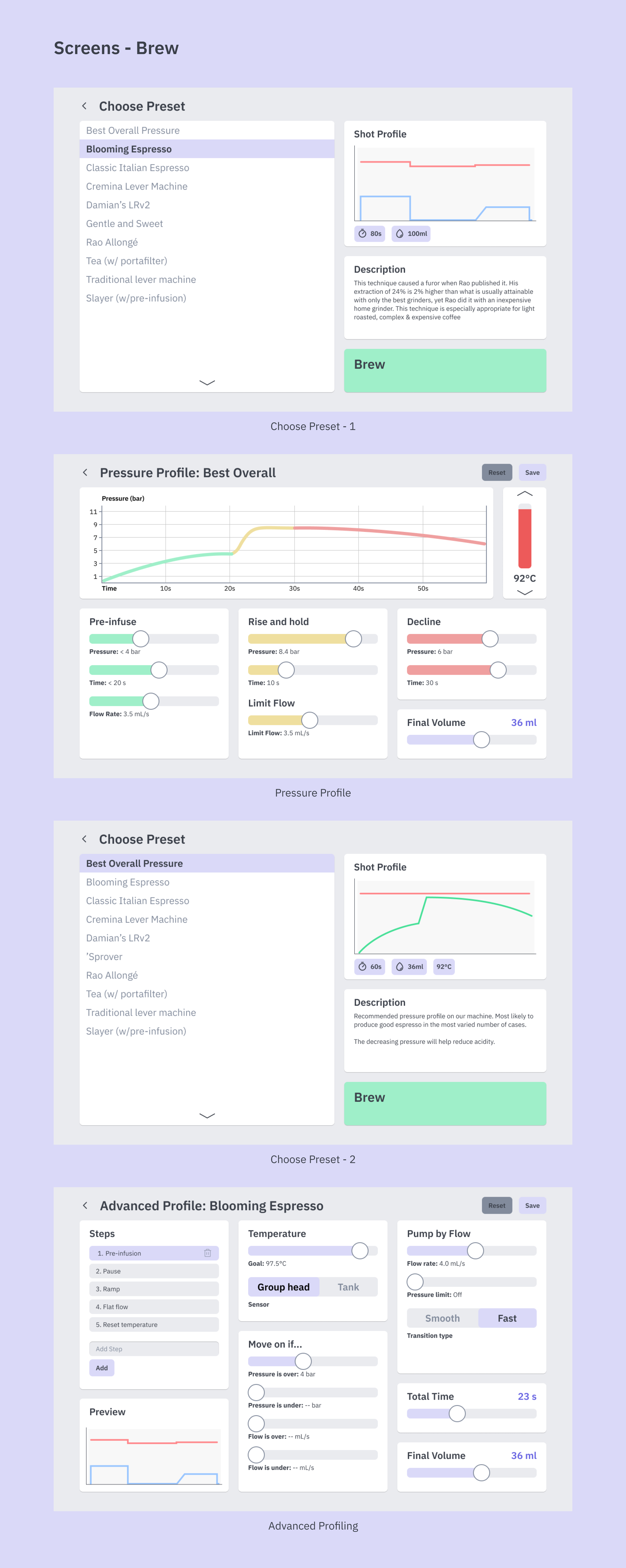
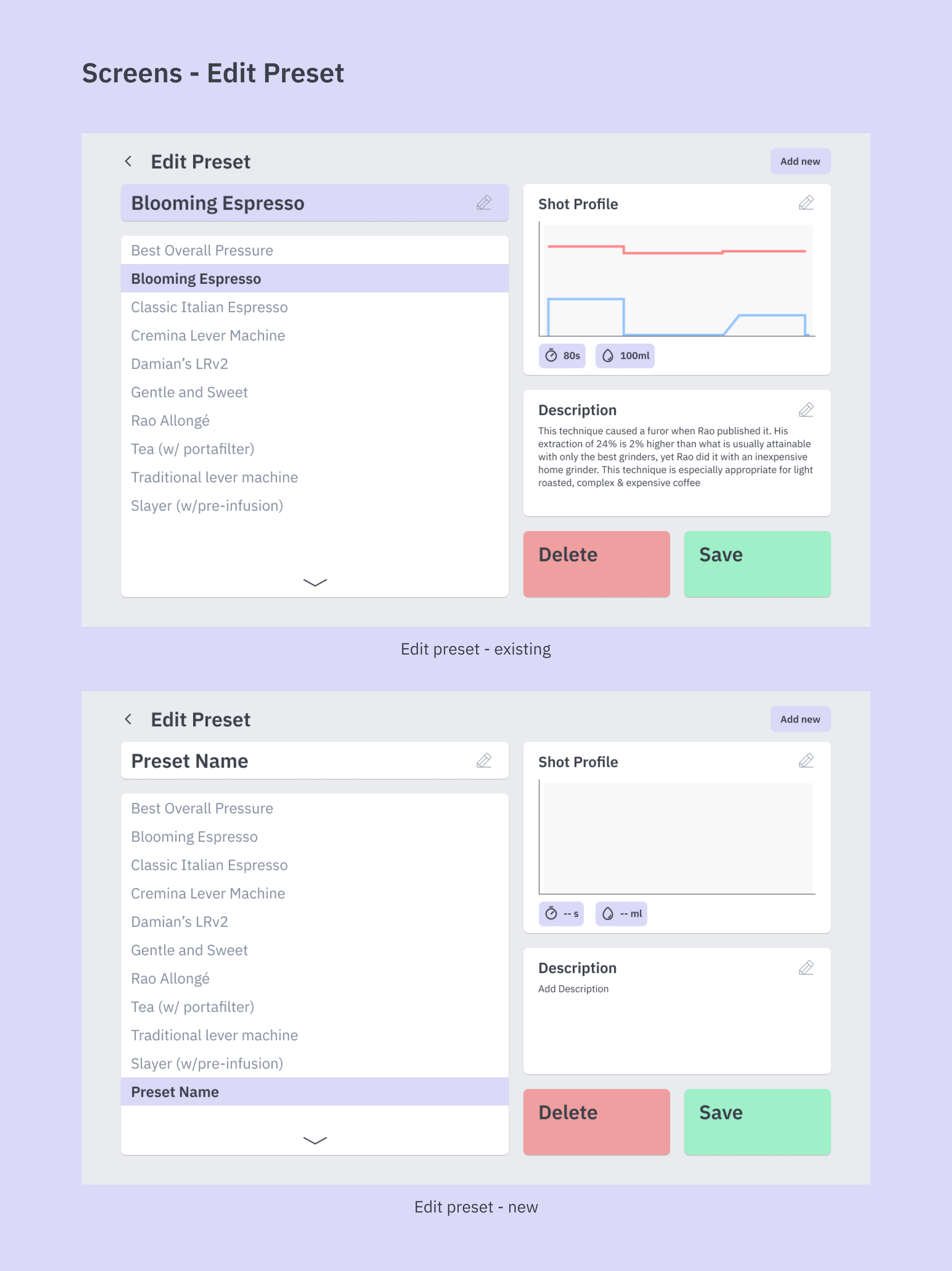
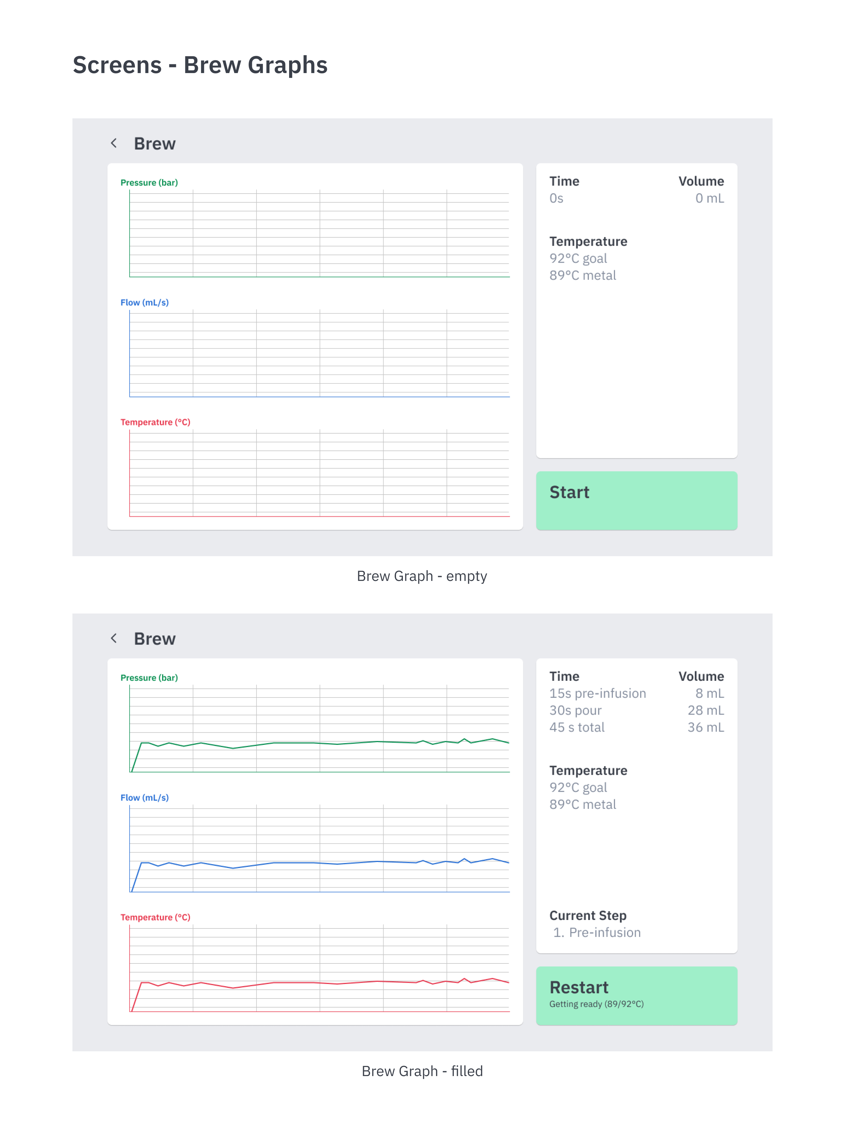
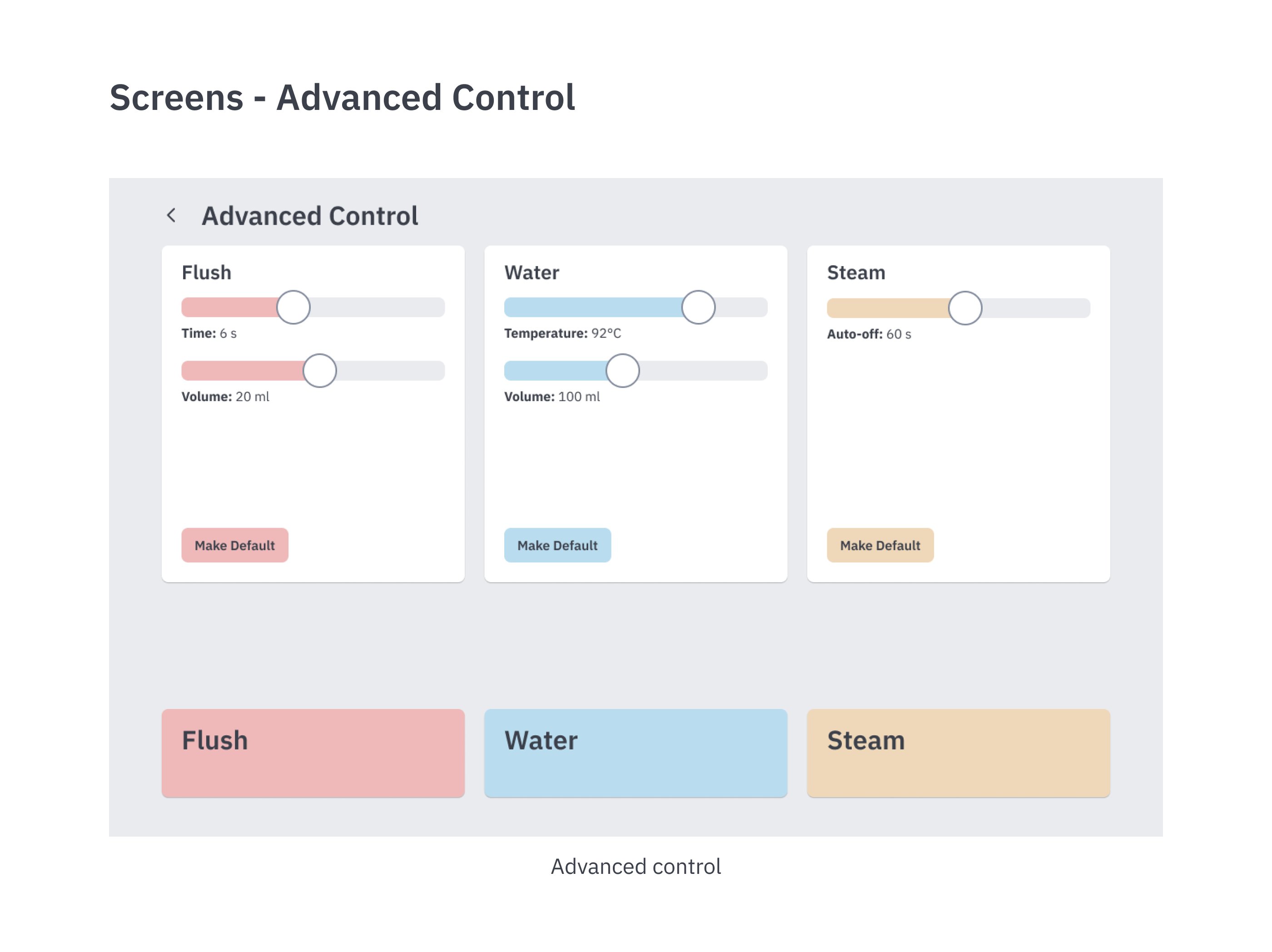
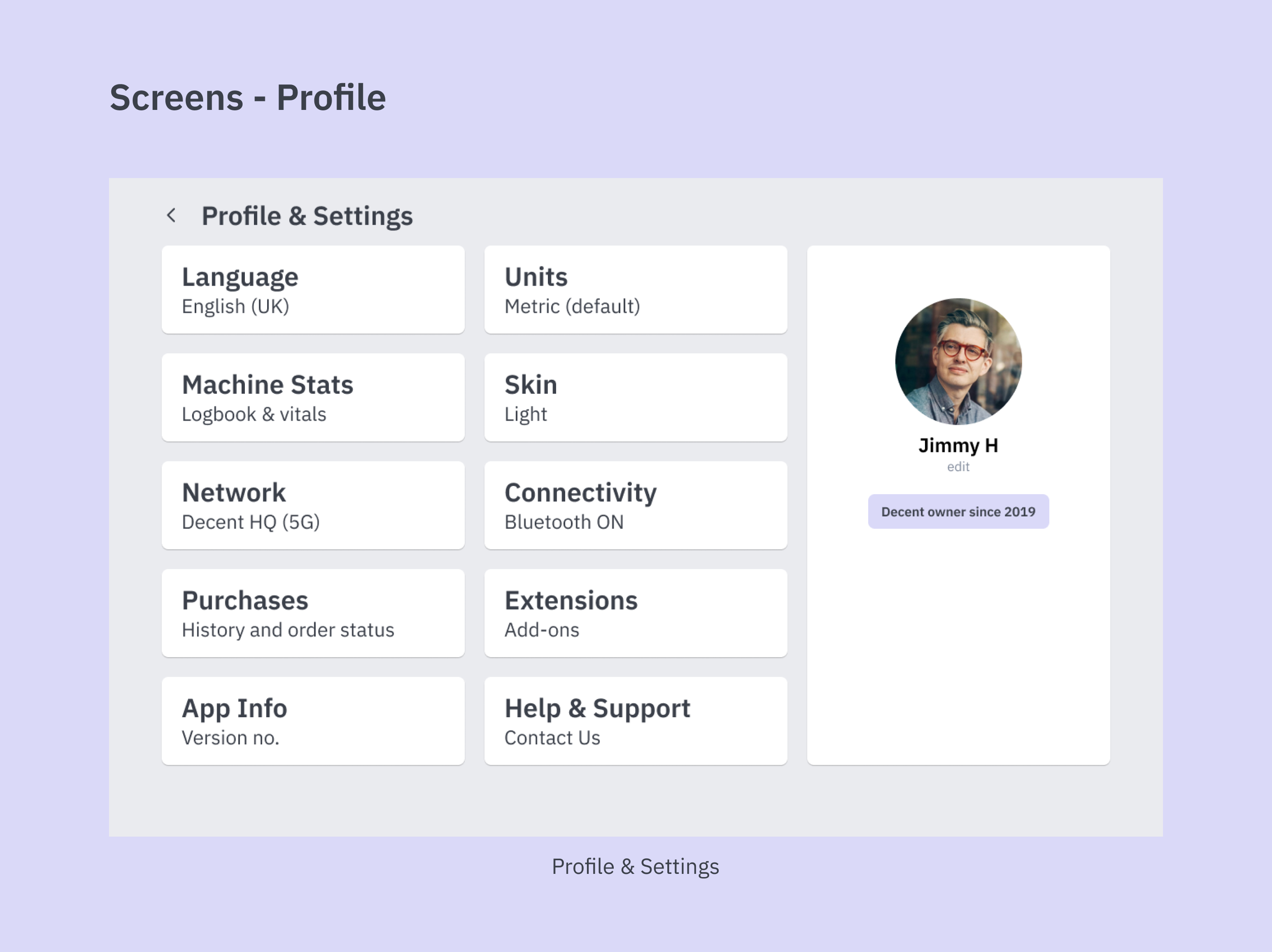
Creating screens for profile was very difficult, since I had to break some layout guidelines that I have been following throughout this project. Hence, I took inspiration from the home page of the application and created something along those lines.
Learnings
This project taught me three key principles in UX and UI design:
- Clarity > Features
- Designing for non-scrollable/ static screens
- Software Architecture
After weeks of studying the interactions and the features nestled within the Decent app, I have emerged victorious with a better understanding of how these pieces of software are created. There are many micro-interactions my static screens have missed (e.g. graph changing when changing parameters) and it doesn’t do justice to the nuances of the original application.
However, I am confident that this UI can seamlessly integrate many of the golden features that are present in the app without any hassle.
The most interesting part for me was to re-map the entire IA of the application in a way that was both accessible as well as concise. I have some knowledge of how parts of the software communicate with each other, but doing it in real life (albeit a fictional project) gave me much needed confidence.
Future Scope
I believe the only way to go about is to actually build myself one of these interactive, responsive dashboard UIs. I am always in awe of what I see on Dribbble and Behance, and the creativity that exists in the community. I am also very aware of the shortcomings of such designs. But it will be a good challenge to see how I can code them and fire them up for other people to use!
Undertaking another product building project will not only do wonders to my confidence, but will also present you with an excellent opportunity to feast your eyes.
Thank you very much for your time.
Hope you found this presentation Decent :)