Mumbai Metro Project
Future of commute in the great city
Introduction
Framing the problem
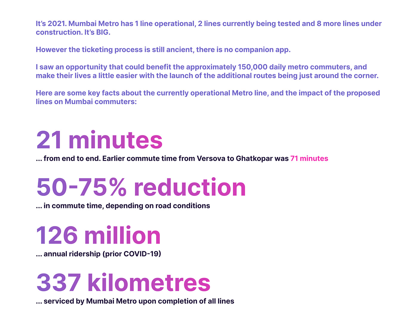
The current metro system is quite straightforward, offering a single route that hasn’t changed since its launch in 2014. However, things become more complex as the metro expands to cover the entire city. A vast network of 14 lines, spreading over 337km and housing 225 stations. Now this is where things get tricky.
This ambitious project is dedicated to advancing the city’s transit systems, with the goal of rivaling the convenience and efficiency of the New York City subway, Taipei Metro, and the London Underground.
The opportunity lies in making user journeys smoother and reducing the learning curve for navigating this extensive city-wide infrastructure, improving the experience for all commuters.
Let’s look at this from the eyes of a commuter.
User journey
It all starts with buying a ticket. Users can purchase a ticket in the following ways:


After purchasing a ticket, users proceed to security check, similar to airport security. Security takes 10 to 15 seconds per person, excluding wait times.
Problem Statement
Excessive wait times in queues and potential confusion during transfers between multiple metro lines are evident pain points in the user journey. Using LED indicator boards as a means of wayfinding may lead to incorrect train choices, platform mix-ups or even board malfunction. Users may also need to manage multiple tokens, which can be inconvenient.
Given the challenges of full digital adoption in a diverse country like India, the app’s goal is to enhance the station experience and reduce the reliance on booking tickets directly at counters.
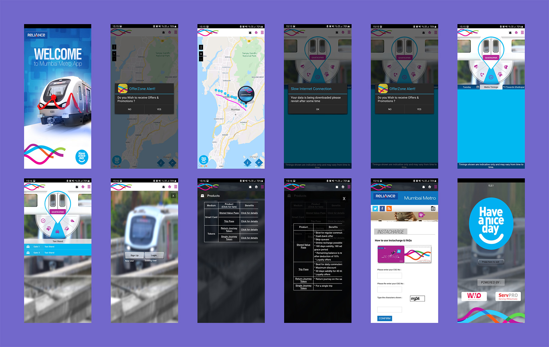
The metro also had a companion application that was functional until early 2020. It has since been removed from mobile app stores. Here is every single screen from the now inactive app:
Define Design Brief
The metro application strives to achieve a lot, but the user experience is not great. Here are the major problems with the depracated metro application:
- has not been updated in years
- UI is not user friendly
- too many popups
- many missed touches/ interactions
- overall disappointing UX
How can we make this better? How do we fix this and bring users on board to discover a world of possibilities?
How do we build a clean and scalable application that achieves the following:

I worked on this project during the middle of the pandemic, when I could not get in touch with any active users.
I was fortunate enough to have had many conversations with users I met during my metro rides, and those conversations helped me shape this project the way it is.
Understanding the users
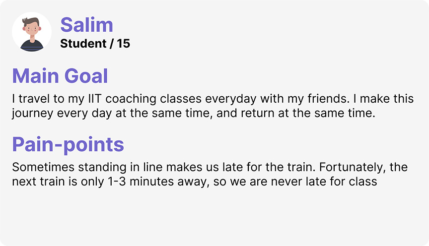
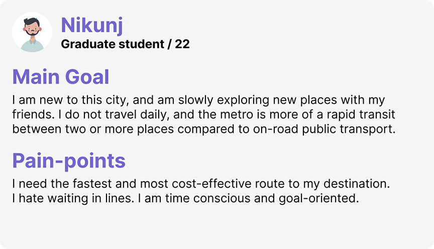
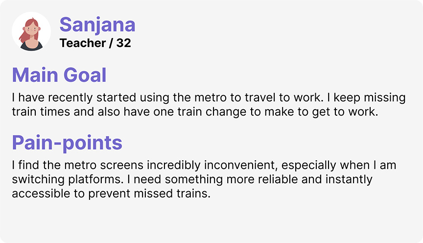
Through my experience with the Mumbai metro, I have narrowed down the users into four categories:


Who are we designing for?
Before getting into specific user profiles, here are the basic prerequisites for the user:
- comfortable using feature-rich mobile apps
- able to make payments through mobile apps
- comfortable using location services
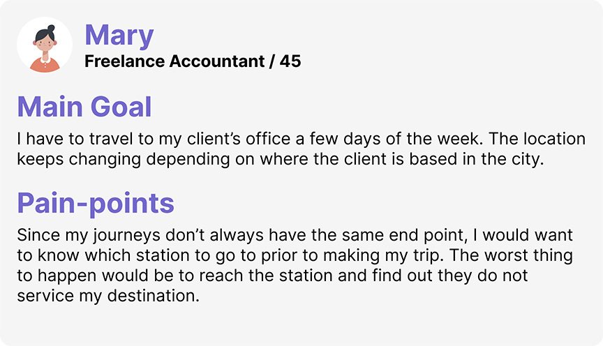
Understand Requirements
Since this project aims to serve present users, but also the users who don’t yet exist, it is important to understand the requirements explicitly. The requirements are bound to change when other lines are functional and see some users, but till then I will have to do my best to approach this situation pragmatically, and anticipate user needs in the future.
Define Approach
I aimed to understand all existing and potential interactions, spanning from booking, viewing station facilities, public transport connections to reaching the destination. My approach involved exploring and brainstorming every conceivable scenario.
Rather than reworking the current application, I drew inspiration from the feature set it introduced in 2014. The app was ahead of its time, but poor user experience and a lack of incentive didn’t help it achieve its full potential.
I meticulously assessed the app’s current information architecture, pinpointing errors and inconsistencies that adversely affected the user experience. This analysis served as the foundation for designing the user flow of the new application.
Information Architecture
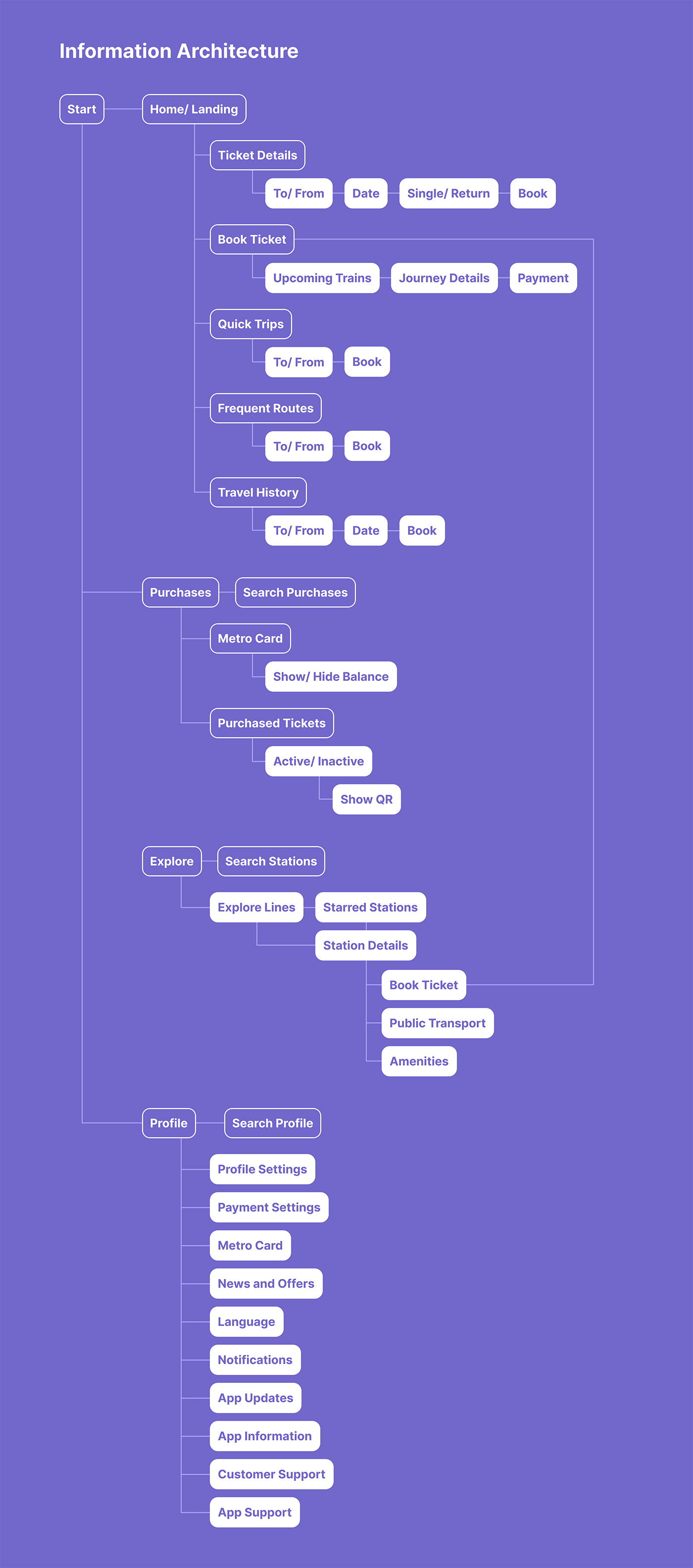
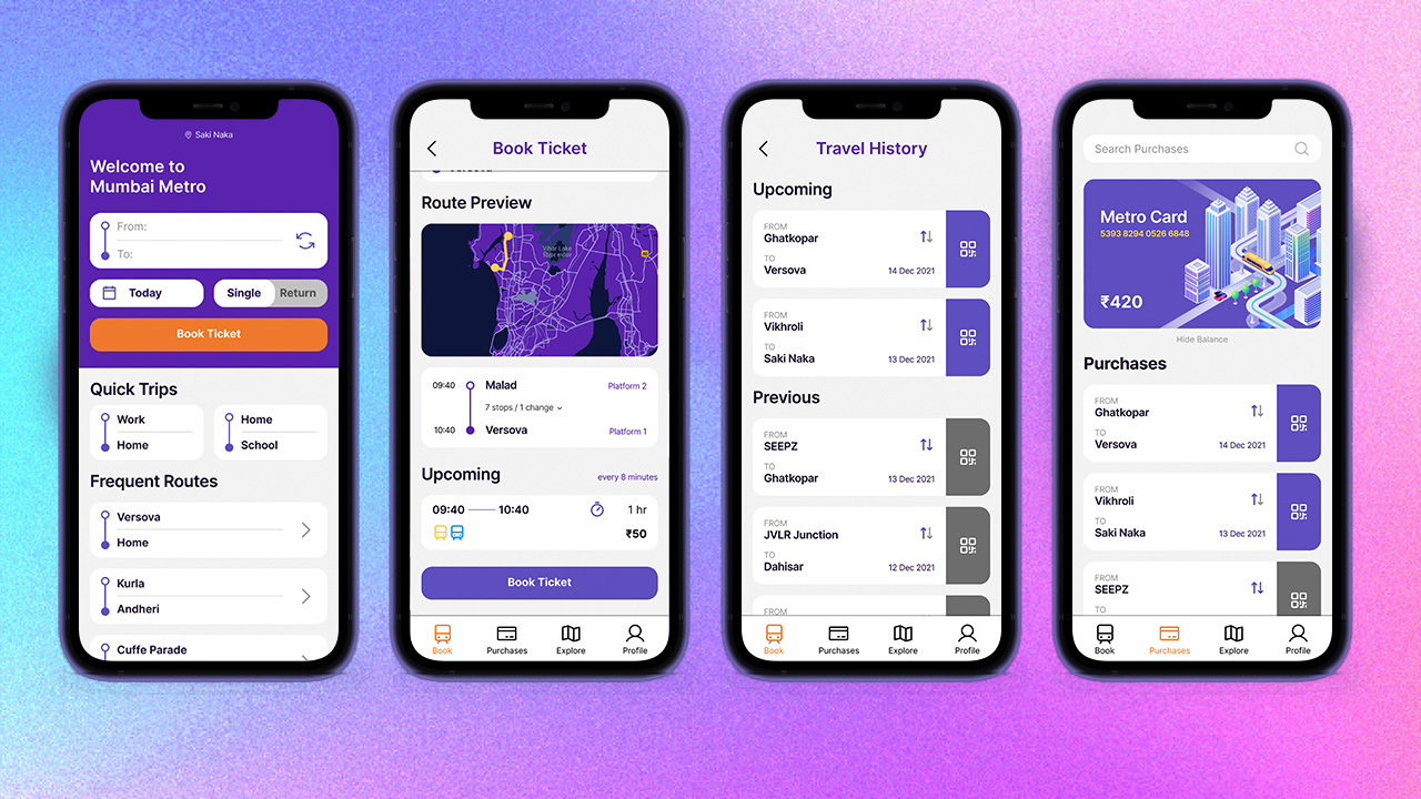
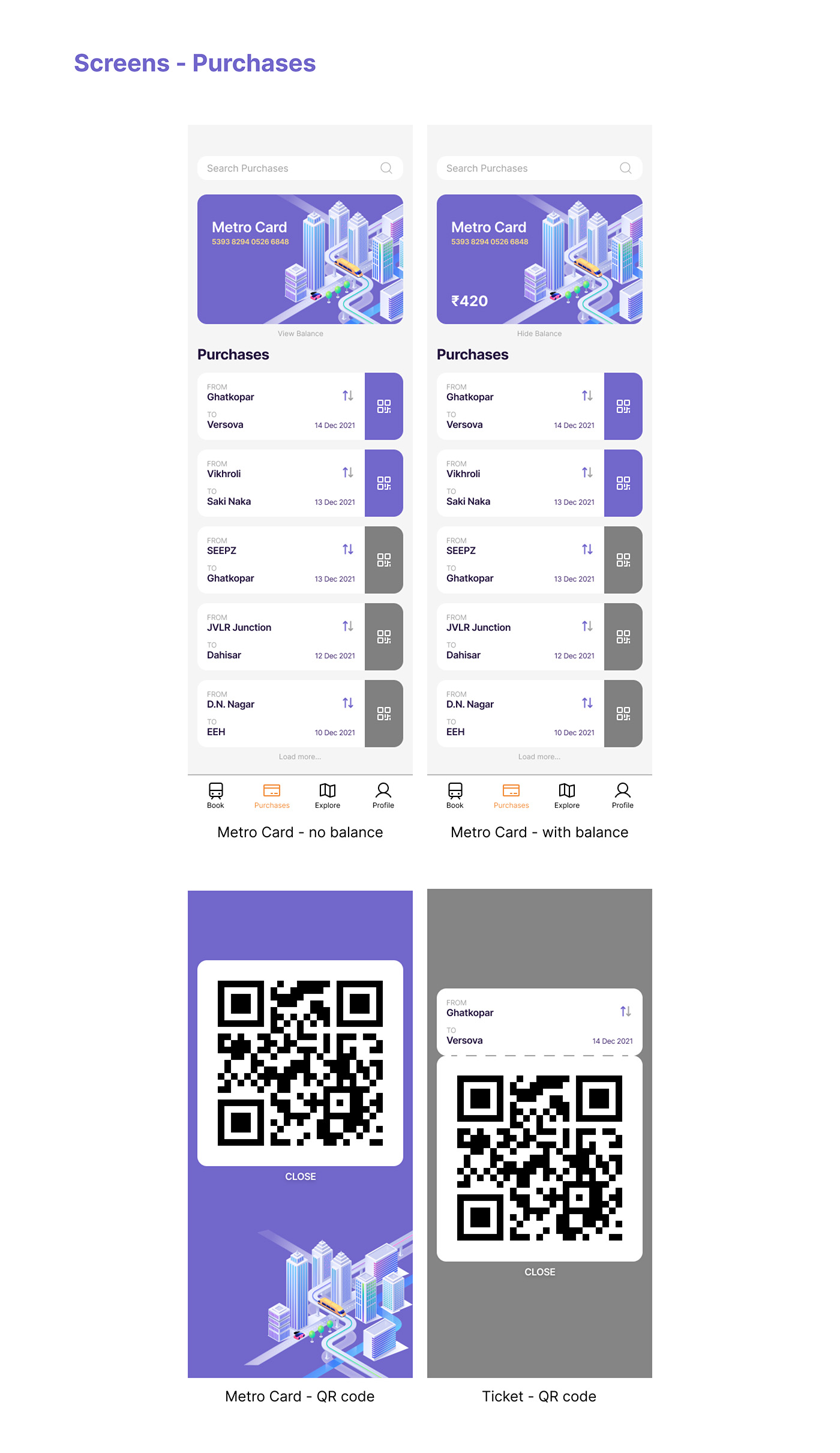
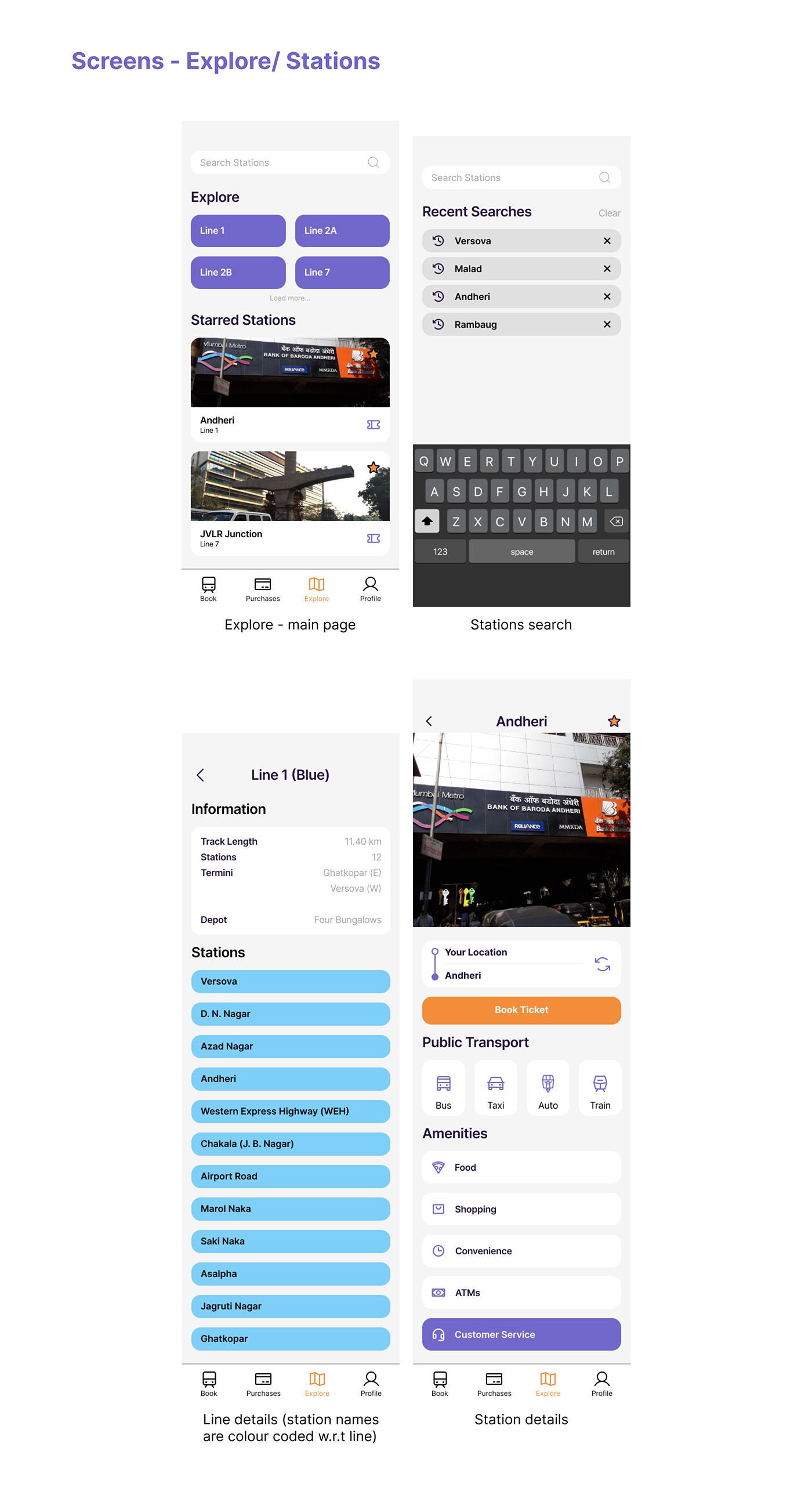
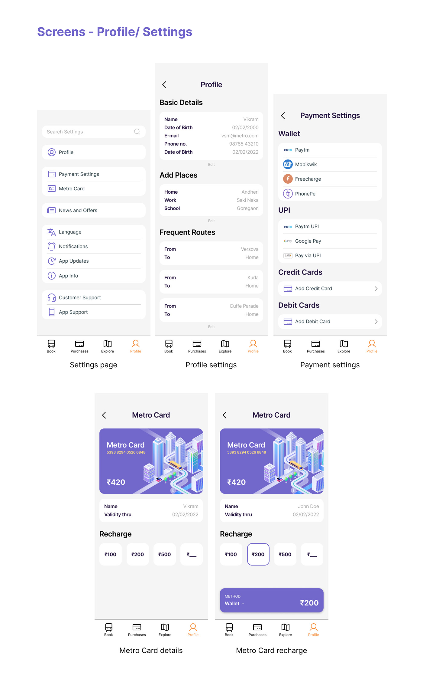
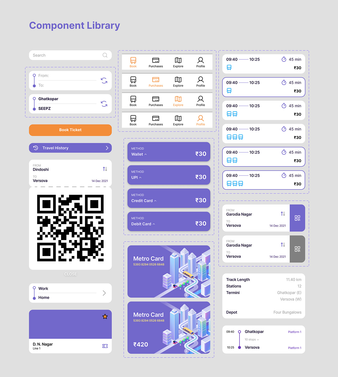
Now that I have a goal and a roadmap of how to proceed, I designed the final visuals.
This is the result of many many iterations, and many more hours of just staring at the screen (fellow designers can relate 😅)
Enjoy!
Visual Design

Learnings
This was one of the most exciting projects I have worked on. I believe an intervention like this will increase the user’s experience multifold and is much required in times like these.
This was my first time working on a project without conducting preliminary user research, and I am now aware how crucial the role of the user is in the design process.
I am sure I will be able to apply my learnings in future projects and come up with similar experiences for users around the globe.
Future Scope
In addition to everything mentioned before, I would love to conduct surveys to understand the main goals of the users in the future, once the lines are actually constructed and operational. It is one thing to speculate how something might be in the future, but the reality of it may be completely different when it is executed.
Also, it would be great if I could work with the guys over at Mumbai metro and make this concept into a reality. I believe this has the potential to make millions of users’ lives better!
how to increase business? offers, discounts, APP ONLY queue
